Graphs have become an essential tool for organizing data. They make complex numbers and data easier to understand, so you can quickly highlight the changes and trends without using too much text.
Pie charts are among the most popular tools in the world of graphs. They are very effective in displaying percentages. However, this graph also shows some limits in illustrating trends.
There are many tasks in pie charts that cannot highlight the intended meanings. Despite their high aesthetic aspect, these tools cannot tell stories using data effectively. Here are some better alternatives to the pie chart to consider.
1. The Dumbbell Chart
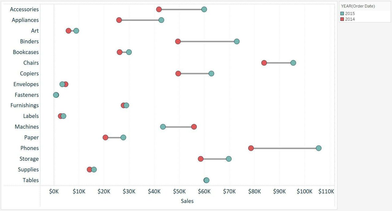
Also known as DNA charts, this graph can illustrate the changes between two data points effectively. These charts look like a strand of DNA arranged on a horizontal side, thus giving its slang name.
The Dumbbell chart is among the most convenient tools for comparisons. It can compare virtually an unlimited number of data points. Yet, adding too many values can cluster the chart and make it difficult to read.
| Pros | Cons |
|---|---|
| * It’s aesthetically appealing and simple to understand * It is easy to set up | * It can get clustered when there are too many values |
2. The Bump Chart
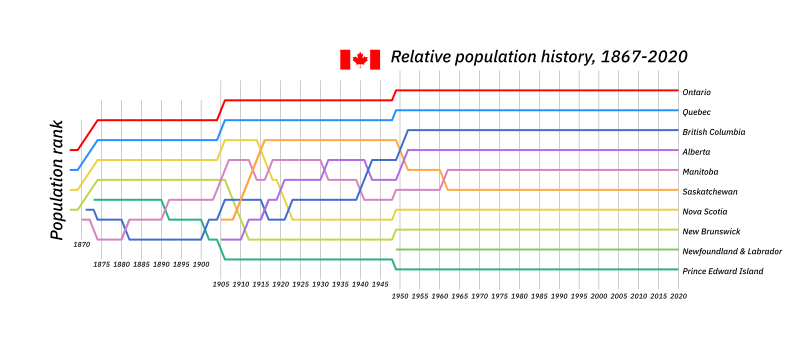
The bump chart is excellent for displaying changes in rank over an extended period. It helps compare the performance or rankings of many values in an organized pattern.
This tool features many similar traits to the line chart. Suppose you want to highlight the ranks as the most critical aspect of a data point. Then, the bump chart is the ideal option.
| Pros | Cons |
|---|---|
| * It’s ideal for displaying ranks within different values and groups * It doesn’t require actual values to set up | * It cannot display relative magnitudes effectively |
3. The Donut
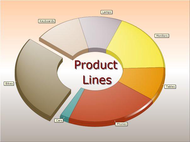
A donut chart is a unique tool with the closest features to pie charts. You can cut out the center of a pie chart to convert it into a donut. This design helps reduce the confusion caused by the area parameter.
With the removed center, donut charts help the readers concentrate more on the arc’s length. Thus, they will avoid comparing the arc to the total circle area. You can also use the center space to display extra labels and data.
| Pros | Cons |
|---|---|
| * It is aesthetically appealing and easy to understand * It gives extra space for data and labels | * It cannot display trends or complex data |
4. The Treemap
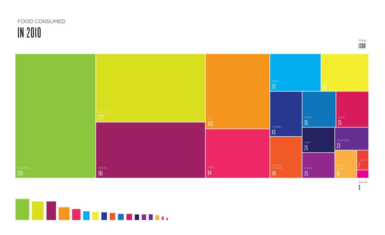
One primary setback of the pie chart is that it doesn’t show the differences in angles. Treemap can tackle this problem by dividing the surface into small rectangles.
Each rectangle represents a unique group of data. The rectangle’s size directly reflects the proportion of that group. Thus, readers can visualize the differences between the groups more effectively.
| Pros | Cons |
|---|---|
| * It can display hierarchical data more effectively * It can illustrate many elements without getting clustered | * It cannot display comparisons as precisely * It is time-consuming to set up |
5. The Waffle Chart
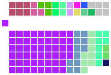
This graph consists of many square cells from the grids. Each grid represents a percentage of the whole. This design makes the waffle chart an excellent tool for illustrating proportions.
The advantage of waffle charts lies in their simplicity. You can quickly spot the differences by looking at these charts. They are attractive and easy to set up.
| Pros | Cons |
|---|---|
| * Work well with nontechnical readers * It possesses a high aesthetic appeal | * It cannot display too many data points effectively * You cannot add texts or numbers to the chart |
6. Line Chart
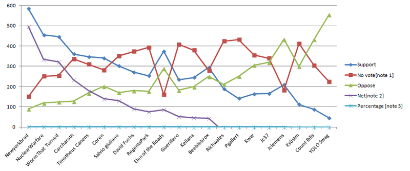
The line chart is the finest option if you want to illustrate changes over an extended period. You can include many groups in a line chart to make comparisons between them.
Thus, a line chart helps you demonstrate the changes that happened to these groups in the same period. It also creates room for accurate predictions about the future trends.
| Pros | Cons |
|---|---|
| * It is effective in making predictions * It works well for measuring performance * It can keep track of changes in a period | * It is not suitable for fractional or decimal values * Adding too many groups can make the chart difficult to read |
7. Bar Chart
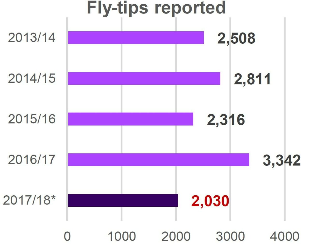
The bar chart includes bars that represent numbers and percentages. It is particularly effective in comparing data and numbers. Thus, you can quickly highlight the differences between entities.
A bar chart consists of two axes. The vertical axe is the x-axis, while the horizontal one is the y-axis. There are also other varieties, such as grouped or stacked bar charts.
You typically need to provide extra explanations in a bar chart. This tool is very popular in the fields of finance and sales. Many employers use bar charts to track the revenues and expenses of their businesses, for instance.
| Pros | Cons |
|---|---|
| * It features high popularity with wide applications * It is easy to set up and organize * It makes studying patterns simpler | * It needs extra explanations * It doesn’t show progress |
8. Column Chart

The column chart is the vertical version of the bar chart. It helps to represent data by using a combination of rectangular bars arranged next to each other. The bar’s height will represent the values of the given data points.
Similar to bar charts, this tool is effective in comparing different items. It can also highlight changes and help readers predict future trends. This graph is ideal if you want to compare only two data points.
| Pros | Cons |
|---|---|
| * It is ideal for comparing values and highlighting changes * It is attractive with an organized and simple setup | * It gets difficult to read when you add too many data points * It is not ideal for complex data |
9. Area Charts
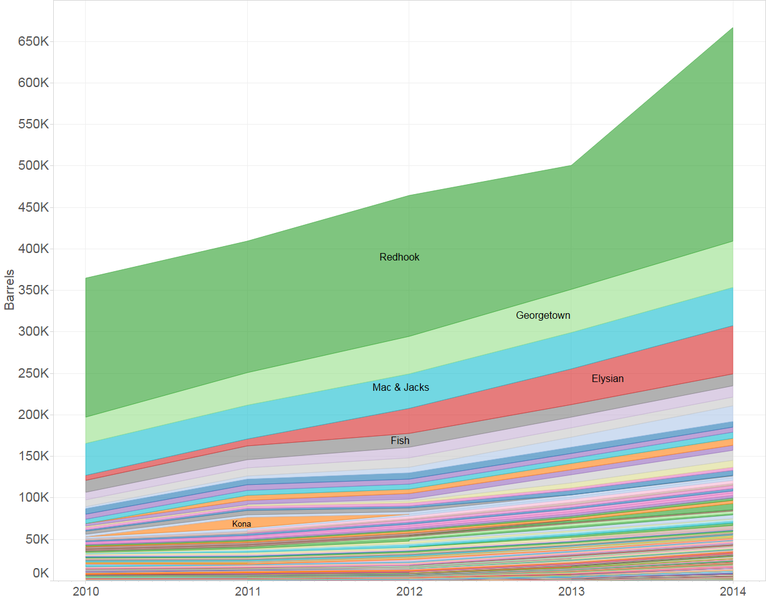
Area charts show how one value of a data set changes over a period. It takes one step further than line charts by displaying the volume of the values. There are two main types of area charts, including stacked and overlapping charts.
The overlapping chart demonstrates the progress of more than one data set. Meanwhile, the stacked chart helps highlight the relationships between groups.
| Pros | Cons |
|---|---|
| * It helps compare the changes in segments over a period * It is more effective than line charts in displaying the volume | * It cannot work well when having many groupings |
10. Box Plots
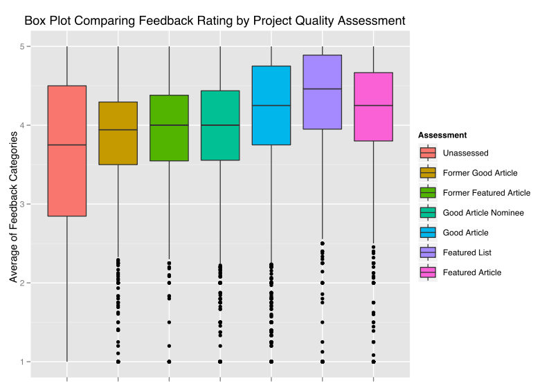
A box plot helps display datasets using five statistical number summaries. Box plot charts have no tuning parameters. They are a useful tool for comparing the distributions between different groups.
| Pros | Cons |
|---|---|
| * It can organize a vast volume of data with outlier values | * It is difficult to interpret for nontechnical readers * It takes a lot of time to set up |
What Chart Is Better Than A Pie Chart?
If you want to display the proportions and compare the volume of many data points, the bar chart is one of the most effective alternatives for the pie chart.
You can add extra labels for the groups to minimize the confusion caused by pie charts. This tool highlights the trends and variations better than the pie chart.
Final Thoughts
All the listed examples have their advantages and limitations. The key is to identify the trends and values you want to demonstrate from a data set. It will help you pick a suitable graph for your intentions.
Also, consider the volume of data and the number of group values involved. Picking the right chart will help convey your message better and attract readers’ attention. Thank you for reading!
